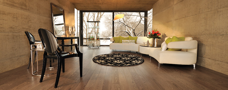
It was the German psychologist Kurt Koffka who said, “The whole is other than the sum of its parts.” This doesn’t ring more true than with interior design. A co-founder of the Gestalt Principle, Koffka was able to articulate how we as human beings interpret our surroundings both intrinsically and culturally.
One of the central theories of the Gestalt Principle is the way we see and, to use the term loosely, define an object or group of objects—be they tangible or intangible. As we are viewing an object or physical space we first identify what we are looking at as whole. It isn’t until we have learned or understood what it is that we begin to see its individual parts.
Think about when you enter an interior space. Have you ever classified an interior space as friendly or confusing? If you don’t understand the function of the room, it doesn’t matter what the furniture looks like or how the light filters through the space; its design has been poorly executed. E.M. Forster captured the misunderstandings of the interior will in his novel, Howard’s End. As Margaret Schlegel walks through the house that is Howard’s End, she finds that the rooms are indistinguishable, one from another. “Dining room and drawing room—right and left—were guessed only by their wallpapers. They were just rooms where one could shelter from the rain.” When we aren’t given clues as to how a space is meant to be used, the room’s function is lost. The question is, how can we help ourselves and our guests to feel at home in the space, while also making a statement? What is the answer?
The Three Spaces to Reinvent for an Impressive Home
-
The Entryway
Your entryway sets the tone of your home. It doesn’t matter how well put together the other rooms are, if the entryway is uninspiring, you and your guests will find the rest of the home uninspiring too. First impressions are lasting impressions, and it takes a lot of hard work to change someone’s mind about an experience or a person they have met with dissatisfaction. No one will notice the beautifully carved table supporting the Tiffany vase filled with tulips. No one will notice the Paul Klee print if the lighting design is sub-par. When the lighting is off, everything is off. Remember, it’s the thing in its entirety that people notice before they recognize the building blocks that have made it.
As you or your guests first enter your home, you will want your entryway or foyer to be met with satisfaction and delight. HGTV suggests that hanging an elegant chandelier will add sophistication and a dash of panache to your home. The lighting will cascade down through the space and highlight the design elements of the room. The color of the tulips and the Paul Klee print will revitalize the space and make it rich in color and welcoming in spirit.
-
The Living Room
The living room is the most used space in the home. It serves a variety of functions. Whether used for relaxation and solitude or playfulness and celebration, the living room is really a room of wonders; it’s always in transition and at play.
Conversely, without the right kind of lighting, the living room is made to be more a den of neglect. To enhance this space with a transfixing modern lighting effect, Elle Decor recommends that you focus your light source and integrate layers of light. Placing one lighting fixture in the corner of the room and others on a table top or other surface at varying levels of height dramatically changes the space. Layering light brings attention to the activities in the space, making it completely user friendly. If you’re looking for modern lighting ideas, Lumens is currently hosting a spring sale with a wide variety of stylish options.
-
The Dining Room
To create a feeling, you must establish a fount of light. The dining room is a space for eating and conversation. It is where we gratify our hunger and acumen. HomeDesignLover advises that we hang a pendant light above the dining room table. The pendant light spotlights the dining experience through down lighting, shrouding yourself and your guests in a pool of light.
Down lighting will help you and your guests to be entirely involved in the experience, with rapt attention held on the great conversation and delectable food. What is more enjoyable than sharing a good meal and a witty exchange amongst friends?
A space well received is a space well designed, it’s as simple as that. To envelop your visitors in a space of pleasure and amusement, fill your home with planes of light.
Photo by Boa-Franc on Flickr.


These are three areas of the home that can be fixed up by good lighting or a good light fixture really easily. Thanks for sharing!
I really appreciate and keep writing.This is a great inspiring post. I am pretty much pleased with your good work. You put really very helpful information. I am looking to reading your next post.
I think my favorite place to see new lighting in in the dining room because it is usually the most beautiful room in the house. Thanks for sharing!